
Earlier this year the Cubs announced a contest in which fans could save them the expense of hiring an actual graphic designer and create a logo for the 100th anniversary of Wrigley Field. Â Many of us toiled for months perfecting our designs, and the Cubs have announced the four finalists, and will pick the winner Saturday.
Let’s check out the final four contenders:
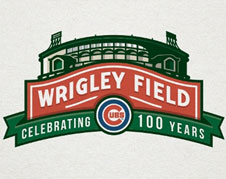
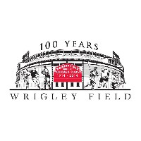
This one’s nice, it’s like the old stadium is floating on a red tide of losing.

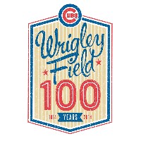
This one sucks. Â Wrigley looks like it’s going to burst, maybe it’s supposed to be full of fat people? Â If that’s the case the Missouri state flag should be flying near the marquee to indicate it’s a Cardinals game.
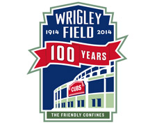
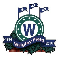
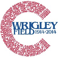
This is oriented vertically, and would be much better if it said Chicago Cubs at the bottom so it could remind everyone of the standings.
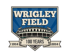
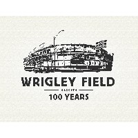
Hey, nice, somebody went to iStock and bought a blue radiant background for four dollars. Â What I like about this one is that it’s the only one to include a famous Wrigley Field rat in the design. Â See him scurrying there at the bottom in front of the stadium?
So none of these are all that good. Â On that landing page, the Cubs promise you can “Check out all the entries” which is bullshit. Â They claim they got 1200 of them but that gallery only has 37 designs in it.
Check them out, they’re awful. Â Especially these:
The thumbnail is terrible quality, but this one has a football player on it, a couple of baseball players and, of course two hockey players because the Blackhawks spent almost three hours there one day. Â I’m surprised they don’t have Jason Aldean hanging off one of the light towers.
Sure, why not, let’s just slap the W from the win flag right on the clock? Â Why not have Ben Grieve’s bloody face still stuck in the ivy then, too?
If John McDonough were around this one would have won. Â Pinstripes, amber hued background, that awful font. Â Stick a Beanie Baby on it and we’ll start stitching it to the jersey sleeves.
Nothing says iconic logo like a shitty line drawing of the building. Â Bravo.
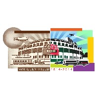
This abomination really needs to be seen at actual size to fully enjoy it:
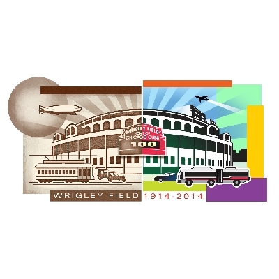
Remember back in 1914 when zeppelins ruled the skies and the moon was 1,000 times the size it is now? Â All the fans took trolley cars to the games and everything was in black and white and people all walked funny! Â Now, Wrigley is right in the flight pattern for O’Hare and is run amok by accordion buses! Â All that’s missing in the 2014 half is a drunk frat boy throwing up on the Ernie Banks statue.
Well, at least one sixth grader got his or her entry through.
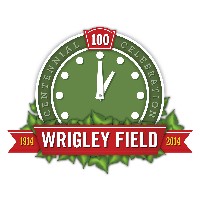
You knew somebody would do it. Â The clock with some weeds on it. Â Gee, how did this not win?
Anyway, so what about the other 1,163 entries where are they? Â How many of them were mean spirited? Â Those are the ones I’d like to see.
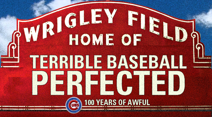
I admit, I’m mad that my design didn’t win. Â But that doesn’t mean we can’t feel free to use it all next year:

Andy what ever happened to your idea for the logo??
You didn’t even mention the absolute worst one. The one where the second ‘0’ in 100 is, for some reason, the seating chart for old Veterans Stadium.